
Luxury interior paint colors play a pivotal role in high-end home design because they do so much more than just color a space—they set the tone, mood, and the perception of quality for everyone who enters. High-end interior paint colors also reflect personal style and taste, as well as larger global influences and modern or traditional aesthetics.
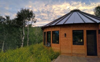
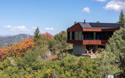
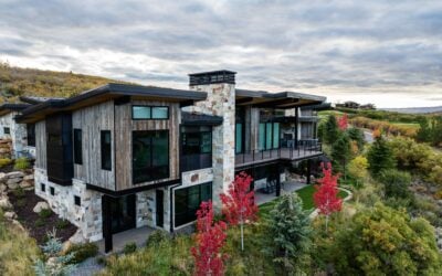
Modern mountain home colors commonly used in Park City luxury home design by Tall Pines Construction are often an inspired blend of rustic charm and contemporary elegance. But the luxury paint colors you choose will ultimately come down to the ones that best reflect the atmosphere you’re looking to create at home.
The Best Luxury Interior Paint Colors for High-End Mountain Homes
One of the things that makes choosing the best interior paint colors for luxury mountain homes so fun is that they’re meant to complement the beauty of their natural surroundings. Inspiration can be found in indomitable snowy peaks, glistening alpine lakes, dense pine forests, or uncompromising granite crags. Inside, they should harmonize with or accentuate the effect of architectural focal points, such as rich wooden beams and rough stone fireplaces.

Luckily enough, that means there are hundreds of elegant interior paint colors perfectly suited for your custom mountain home. Here are just a few of our favorites to help spark ideas for your own space.
Favorite Luxury Interior Colors for Mountain Homes
Before getting too deep into actual color options, we should mention that paint sheen and finish do have a significant impact on the level of luxury they denote. It used to be that a higher shine was associated with class and wealth, but the tides have turned, and a more luxurious look can be created using eggshell (for most walls) and semi-gloss (for high-touch areas like baseboards and doors) paints. This is mainly due to their higher pigmentation and soft finish that can feel richer and more upscale. Both more matte and glossy options can look cheaper depending on your aesthetic.
Now, when it comes to choosing our favorite luxury interior paint colors, let’s break them down into a few easy-to-navigate categories: warm neutrals, earthy naturals, and more moody tones.
WARM NEUTRALS

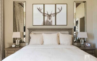
It might seem like you could narrow down our warm neutral palette to one perfect off-white, but the truth is—because color is so relative—that slightly different shades will work better in different homes and spaces depending on the use of other colors in the area, both painted and natural, as well as lighting, and other variables such as art, furniture, and hardware. So, we have a few neutral luxury paint colors that will work in a variety of spaces and complement any interior design style.
Swiss Coffee by Benjamin Moore
It’s just warm enough to liven up a room without feeling too aged or out of date. It reads cozy yet modern.

Baby Fawn by Benjamin Moore
With the slightest of pink undertones, Baby Fawn evokes a gentle yet purposeful vibe. It’s a step further into the land where neutrals have something to say.

Agreeable Gray by Sherwin Williams
A best seller for a reason, this is the ultimate in warm grays. It settles into the background while helping almost any color palette on top of it pop.

EARTHY NATURALS

Earthy, natural colors are the perfect choice for a mountain home color palette. Relaxed shades of green, blue, and even brown in your interiors can make a space feel like an extension of the sanctuary you’re immersed in, mimicking your surroundings near Park City.
French Gray by Farrow & Ball
More green than gray, this color changes mood throughout the day, depending on the light. It’s a dreamy meadow drench for any space.

Light Blue by Farrow & Ball
Don’t be fooled by the simplicity of its name—Light Blue is a masterclass in color theory. Appearing slightly silver in certain lights, its cool and calming tones are perfect for a wilderness retreat.

Weimaraner by Benjamin Moore
Weimaraner evokes images of the natural world. It works well in a modern mountain home as a natural backdrop to rich animal hides, stone, or light-stained wood.

MOODY TONES

Color drenching is a modern take on adding richness and character to a space, and deep, moody colors work perfectly for it! But even when used sparingly, these richly saturated paint colors can make a room feel decidedly more high-end than if they were left out. Try a few of these popular and moody paint colors.
Iron Ore by Sherwin-Williams
This deeply layered charcoal shade adds sophistication and richness, especially when paired with a well-placed wall treatment.

Cinnamon Slate by Benjamin Moore
This nuanced and velvety purple has rich brown undertones that keep it highly balanced—think more homey than kitsch.

Salamander by Benjamin Moore
Salamander could well be called “chameleon” for its ability to adapt to changing light, all while remaining a reliable source of sophistication.

Modern Vs. Traditional Luxury Paint Colors for Mountain Homes
Modern luxury homes—even in the mountains—tend to lean toward cooler tones like brighter, more pure off-whites and crisper grays, while traditional mountain lodges are known to favor warmer taupes, deep browns, and softer shades of green and blue.
The beauty of it is that you don’t have to be stuck with one or the other. Many of our favorite luxury paint colors are so variegated and versatile that you can lean one direction and still allow for a little play when it comes to enhancing the aesthetic with wood finishes, stone accents, natural and manufactured lighting, hardware, furniture, art, and more.

One tip as you learn to layer these colors? Make sure the major elements in any open-concept rooms play nicely with the space next to them. Smooth transitions play into the perception of quality design and luxury.
Common Questions About Luxury Interior Paint Colors
Curious to learn more about luxury paint colors? Check out our frequently asked questions!
What Makes a Paint Color “Luxury” Compared to Standard Interior Paint Colors?
Luxury paint isn’t just about color—it’s about finish and depth as well. High-end paints often have a more velvety texture that subtly absorbs or reflects light in a pleasing way. Many quality brands have greater pigment concentrations as well. This offers a richer, more saturated look in your space than if you were to use a standard paint. Durability also plays a role in premium interior paints, making it easier to maintain that high-end elegance over time.
What Are the Most Popular Luxury Interior Paint Colors for High-End Homes?
While some homeowners brave the world of color on the walls, most opt for more common hues that create a solid foundation for any interior design style. The most common requests we get are for a crisp, clean white for more contemporary aesthetics, and a slightly warmer hue to soften the walls a bit for traditional designs.


Which Paint Brands Offer Premium Colors Suitable for Upscale Interiors?
Paint brands such as Benjamin Moore, Farrow & Ball, Sherwin-Williams, and Little Greene are all known for their complex, multi-pigment formulas. Opting for one of the higher-quality lines within a brand can also help increase the level of durability and luxury you’ll experience. For instance, Benjamin Moore’s highest line, Aura, promises its proprietary ColorLock technology, powerful fade resistance, and unmatched leveling, which helps ensure a finer finished look.
What Are Some Timeless Luxury Paint Colors that Suit Any High-End Interior?
If you’re looking for absolutely timeless luxury paint colors, you’ll want to head back to the Warm Neutrals suggestions listed above. While none are a basic white like you might expect, they each add a level of cozy warmth that speaks to timeless elegance and sophistication. Try using Swiss Coffee, Baby Fawn, or Agreeable Gray in your next high-end interior design.
Which Luxury Interior Paint Colors Are Best for Maximizing Natural Light?
Soft neutrals like warm taupe, greige, and creamy whites can make a space feel airy and serene, amplifying the work of natural light in a room. But don’t shy away from color either! Natural light can also enliven soft greens and blues and work to enlarge a space just with a window and a little paint.

What’s the Difference Between Matte, Satin, and High-Gloss Luxury Paint Finishes?
Matte, satin, and high-gloss all refer to the level of sheen (or amount of light reflected by) a paint product. Here is a quick guide to the qualities of each and where you may want to use them.
Matte paint has a flat, non-reflective appearance, making it best suited for ceilings and other low-traffic areas. It can hide imperfections well and look high-end in rich, dark hues, but it is harder to clean.
Satin, otherwise known as eggshell, has a soft sheen or reflective glow that is perfect for living rooms, bedrooms, and other high-traffic areas. It’s much easier to clean than matte paint and strikes the perfect balance between livability and luxury.
High-gloss paint is very shiny and is typically only used in details—think trim, some cabinetry, or architectural details. Because it reflects so much light, it can brighten darker spaces, but can feel overwhelming in large areas.
Park City Custom Homes Built to Last: Let’s Get Started

Still have a few questions about luxury paint colors? Or anything else about a high-end mountain home? Contact a Tall Pines Construction team member today!
With Tall Pines Construction at your side, you’ll have the expert help you’ll need from planning through construction! We’re the Park City custom home builder dedicated to the ultimate customer experience, creating everything from floor plans to high-end interior paint colors and luxury home finishes perfectly suited to your lifestyle.