
Paint colors play a major role in setting the tone for a space. They can easily enhance or disrupt the aesthetic you’re going for, so choosing the best exterior and interior paint colors for your mountain home is a big decision! As a custom home builder, we can share our perspectives and favorite recommendations. By leaning into the nature-inspired paint palettes we’ve put together, your Park City luxury home or vacation retreat will not only look and feel high-end, but it will also complement the beauty of its surroundings better than you could imagine.
Nature-Inspired Paint Palettes for Park City Custom Homes
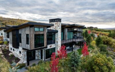
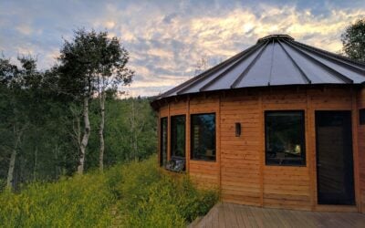
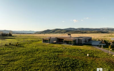
When you build a custom home in Park City, Utah, you’re likely there for what the area has to offer—things like incredible outdoor recreational opportunities and spectacular scenery. So whether you’re inside or outside your new home, you’ll want to take full advantage of the natural vibes. Beyond your personal style, the mountainous terrain, pure natural light at altitude, and even how each season unfolds in Park City may influence your paint color decisions.

So whether you’re looking for earthy tones, cool and serene colors, or bold accents for your mountain home paint colors, we’ve got you covered.
Earthy Tone Paint Colors

The earthy tones we love for Park City custom homes include warm browns, creamy neutrals, and richer, woodsy tones that complement traditional mountain-style homes. Using this palette does not mean you’ll be in a brown-on-brown-on-brown cave, but these shades will help you achieve the rustic retreat vibe so familiar in cozy winter homes that you may be looking for.
Baby Fawn by Benjamin Moore
As neutral as we go without heading into off-white territory, Baby Fawn is a sweet and subtle everyday taupe with just enough personality to make it chic.

Weimaraner by Benjamin Moore
Reminiscent of sleek animal hides and sun-warmed stone, this neutral brown brings the outside world right inside your modern mountain home.

Agreeable Gray by Sherwin-Williams
Aptly named, Agreeable Gray is profoundly versatile in its neutrality. It’s just warm enough to cozy up a space without making a scene.

Cool and Serene Paint Colors

Soft grays, delicate blues, and slightly cooler off-whites make up our cool and serene paint color palette, perfect for reflecting snowy mountain peaks and highlighting a more modern alpine atmosphere. If your personal aesthetic feels contemporary, industrial, or luxurious, these may be the best interior paint colors for your mountain home.
Simply White by Benjamin Moore
Simply White is just barely on the warm side of the white spectrum, but it pairs incredibly well with other cool colors, keeping the room grounded rather than feeling stark—the perfect white foundation for any mountain home interior.

Light Blue by Farrow & Ball
Leaning toward a silvery finish, Light Blue is a dynamic shade that can look blue or green in certain lighting. Either way, it’s an elegant addition to a mountain home’s cool interior paint palette.

Succulent by Sherwin-Williams
Leaning deeper into modern mountain vibes, this shade of slightly dusty green feels just saturated enough to fully bring the outdoors in.

Bold Accents

What is the Park City terrain if not beautifully bold and dramatic? If you’re not afraid of a moody or statement moment, these bold accent colors will be perfect for your custom mountain home. Bring in deep greens and blues, and even chocolatey hues inspired by aspen trees, wildflowers, and—yes—even fungi to make warm, cozy interiors even cozier.
Serge by Farrow & Ball
Bright enough to feel like sunshine hitting the mountainside just right, Serge is one of those deeply dramatic shades that still reflects light—a true blue with zero gloom.

London Clay by Farrow & Ball
The perfect shade of mushroom-rich brown, London Clay is a high-end neutral that would feel incredibly bold as a color drench—envision a dramatic library with camel-colored leather chairs and a lineup of books you’ll never want to leave.

Salamander by Benjamin Moore
A deep, dark green with a few secrets up its sleeve, Salamander is all about the drama. Whether used on cabinetry, an accent wall, or from floor to ceiling, it’ll inspire confident serenity at every turn.

Choosing the Right Paint Colors for Your Home’s Interior
When it comes to choosing the best interior paint colors for mountain homes, we’ve got a few tried and true tips you’ll want to look at before making any final decisions.
- Always consider the lighting. Because a paint color is going to look very different in every kind of light, you’ll want to paint a sample in the space, with the natural and man-made lighting that will exist in the room. Watch the color throughout the day and night to see if it works well with your color palette, and plan to augment with additional cool or warm lighting if you love the color but would like to push it in a particular direction.
- Work with the dominant materials in the room. You’ll want to play nicely with permanent and even semi-permanent fixtures like natural stone fireplaces, tile or wood floors, and other architectural elements and materials. For instance, if you have deeply stained hardwood floors, you might choose a different paint from someone with a blonder flooring color. Both are fantastic options, but require planning within a particular tone (warm vs. cool) and palette.

- Consider the floor plan. Make sure that colors in an open space can flow well into each other or have a natural barrier, such as through an archway or a vertical wood beam, for example. An open floor plan shouldn’t stop you from using color, but it does mean planning strategically. Sometimes the best option is to use a fantastic foundational color, like Simply White from above, and bring in color through art, rugs, cabinetry, and more.
- Know your finishes. Satin or eggshell is the most common sheen for high-traffic rooms in the home because it strikes a balance between a beautiful finish and durability. That said, a room will look more intentionally designed when a variety of sheens are in use. Consider a semi-gloss paint sheen for your baseboards, allowing light to reflect off other surfaces, such as hardware and light fixtures.
FAQs: Answering Common Questions About Paint Colors for Park City Homes
Looking for a few more specifics on modern mountain paint colors for your Park City custom home? Check out our frequently asked questions to learn more about how to choose the best paint color for your Park City home project!
What Paint Colors Best Reflect the Natural Beauty of Park City, Utah?
The shortcut for finding paint colors that best reflect the natural beauty of Park City is to consider warm neutral browns, soft blues and greens, barely off-whites, and possibly a few more striking accent colors that imitate your natural surroundings.

Here’s a short list of our favorites, mentioned above:
Agreeable Gray by Sherwin-Williams
Simply White by Benjamin Moore
How Can I Choose Interior Paint Colors that Match Park City’s Mountain Landscape?
The first thing to consider is your home’s aesthetic and your lifestyle when choosing interior paint colors. Matching the landscape comes more easily when you know whether you’re leaning toward a traditional, rustic mountain home or a more contemporary, sleek design style. That will help you decide if your color palette will be on the warm or cool side of the spectrum, and you can move forward from there.
But here’s another tip for choosing an exact shade for a specific space: take pictures of those natural surroundings and match the colors at the paint store. For example, if you love the shade of green you see in the trees at the edge of your property and want it in your library, snap a photo that best shows the color you want to replicate inside. Then get small samples or paint swatches of similar colors and get them on the walls of the room you intend to paint. Watch how the colors interact with the available lighting and other colors in the home to ensure the final look is what you’re going for.
What Are Popular Paint Color Trends for Homes in Park City?
A few popular paint color trends are happening right now that we think could work beautifully in your Park City custom home.

Butter yellow is having its moment, and we think it looks beautiful in a kitchen. It brings warmth and happiness to the perfect gathering space, even in small amounts, like on the trim pictured here.
And for those more inclined to enjoy a dramatic paint trend, Benjamin Moore’s Cinnamon Slate is a great way to bring elegance to your high-end home.
Another way to stay on trend with your paint choices is to go all out with whatever shade you choose. Color drenching—or painting every part of the room the same color, including walls, ceilings, and cabinetry—is a chic way to bring character to a new build.
How Does Park City’s Elevation and Light Affect Paint Color Choices for My Home?
You might have noticed that at Park City’s elevation, there is a more diffused and blueish tint to the light. That’s due to reduced atmospheric filtering and means you need to take note that a color down in the valley may look a little different in your actual high-elevation mountain home. Getting samples and testing your paint colors is key to achieving the best final look.
How Do I Choose a Paint Color that Complements My Wood and Stone Finishes?
Because wood and stone are natural materials, they’re full of innumerable colors, some of which we don’t even recognize at a glance. So, it’s a good idea to take a piece of the material you’re using for flooring, ceiling beams, or fireplaces to the paint store with you and let some of the less prominent colors guide your paint search. You don’t want the dominant gray of your rock, for example, to be the exact shade you choose for a wall. Rather, you’re looking for something complementary within the same color family.

Should I Use Different Paint Colors for Rooms with Lots of Natural Light Vs. Low-Light Areas?
Light is the number one factor in changing the appearance of your paint color, so yes, you’ll definitely want to adjust your color choices based on whether you have a bright, naturally-lit or dim, low-light space. Often, people opt for lighter colors in darker areas, which can help them appear larger and more open, but it’s not a hard and fast rule. A lot of positive drama can be achieved by using a moody shade in something like a powder room. The true test will always be to get a sample in the space and watch the color throughout the different periods of light to see if you love the overall look.
Park City Custom Homes Designed and Built By Tall Pines Construction
As the premier Park City custom home builder, Tall Pines Construction has the experience and expertise to guide you through your home-building or remodel journey, all the way from planning to the perfect paint colors. In fact, as part of our elite customer experience, you’ll enjoy personalized guidance during your exclusive color consultation with a team whose number one priority is to provide you with the best, every step of the way.
Contact a team member today and customize your Park City dream home with Tall Pines Construction!