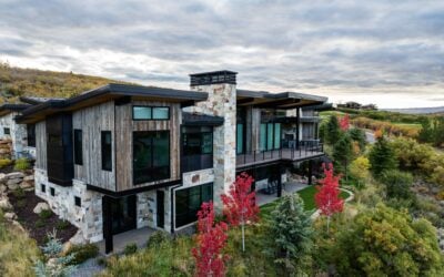

Understanding the mountain modern paint palette is one crucial way to ensure a thoughtfully curated color scheme that plays a foundational role in your luxury interior design. And while we’d never suggest blindly painting any given room in your Park City custom home with one of our favorite shades, there are some guidelines we can help with that you’ll want to take into consideration when looking to set the tone for your home’s mountain modern aesthetic.
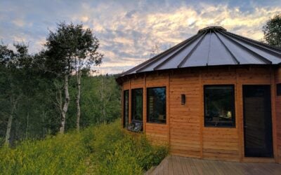
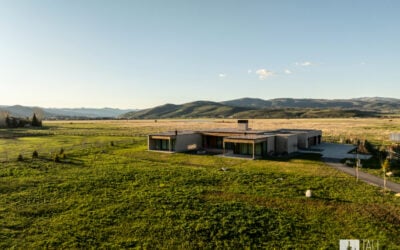
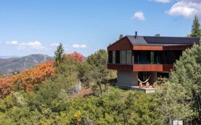
This mountain modern style is brought to life by embracing a balance between clean lines and natural influences, architectural intention, with just a touch of restraint. It’s a reflection of the beauty of Park City’s unique environment, embracing the light, landscape, and materials of our little part of the world, all the while ensuring it feels contemporary and fresh.
All of these things influence and are influenced by the luxury interior paint colors you will choose in your mountain home. Done right, a mountain modern paint palette can enhance the mood, determine spatial flow, and help maintain the long-term value in your custom home for years to come.
So, what are the best interior paint colors for mountain modern homes?

The Best Interior Paint Colors for Mountain Modern Homes
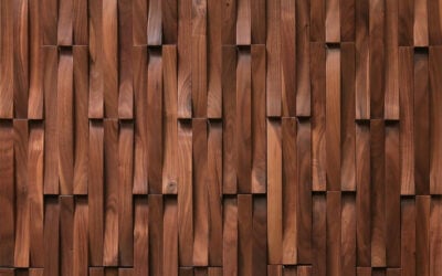
The best interior paint colors for mountain modern homes draw inspiration from natural surroundings—things like stone, wood, sky, water, vegetation, animals, and more—all while maintaining that important contemporary edge. Elements such as large windows, open layouts, wood beams, and stone floors are literal ways to bring the outdoors inside and will also strongly influence the paint color selection for your Park City custom home.
But those aren’t the only factors to take into account when choosing the best luxury interior paint colors. Sheen is another critical factor in both the durability and light reflection of your paint. (The higher the sheen, the harder the finish which is great for cleaning in high traffic areas. It also reflects more light, whereas matte paint may be harder to maintain, but can help create cozy and sophisticated interiors.)
Placement of paint choices is another point to consider, recognizing that while open-concept floor plans are common, you don’t want to feel stuck with one paint color throughout an entire home. Strategically and intentionally planning a cohesive paint palette throughout your home will be critical.
One last element to consider when choosing modern paint colors for your mountain home is the brand. Certain manufacturers work to maintain luxury standards, which can help homeowners achieve depth and consistency throughout, while others may skimp in areas you may regret later. Benjamin Moore, Sherwin-Williams, and Farrow & Ball are all paint brands we’ve learned to love and trust for the power their paint has had in our Tall Pines Construction homes.
Our Favorite Mountain Modern Interior Paint Colors
Whether you’re looking for warm modern neutrals, earth-inspired contemporary tones, or more moody modern accents, we’ve got many beautiful paint options to complement your mountain modern interior design.
WARM MODERN NEUTRALS
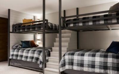
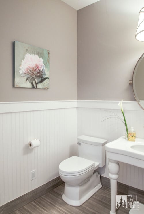
Warm, modern neutral paint colors are ideal for main living areas and larger, open spaces. This placement helps emphasize the flexibility of their foundational utility. But it’s not just functionality that makes these shades work so well in a mountain modern paint palette. These soft whites, greiges, and light taupes beautifully complement wood and stone, brightening your spaces and allowing natural light and surroundings to shine.

Simply White by Benjamin Moore
Simply White is clean and crisp, with just a touch of warmth, helping your rooms feel sun-bright even after sundown.

Agreeable Gray by Sherwin-Williams
Popular for all the right reasons, Agreeable Gray is a well-loved neutral because of its versatility. It leans toward many colors but never falls completely cool, keeping the chill out of any space it’s painted in.

Whitall Brown by Benjamin Moore
Simultaneously nutty and smoky, this neutral brown gives depth and mood to your space without overpowering the overall interior design.

EARTH-INSPIRED CONTEMPORARY TONES
Earth-inspired contemporary tones like muted greens, mineral grays, and colors with soft blue undertones can help reflect Park City’s surrounding alpine environment without feeling rustic or old-fashioned. These shades breathe life into a space but still feel calming, making them perfect for use in bedrooms, offices, and more transitional spaces in the home.

Liveable Green by Sherwin-Williams
This light-touch green lifts any space with an organic, airy feeling. It can lean both warm and cool thanks to its yellow and grey foundation.

You can practically feel the plush-soft leaves of a succulent looking at this shade named for the native plant. It may feel bold, but this modern paint color can easily sink into the background of a cozy library or office space.

Santorini Blue by Benjamin Moore
Don’t be fooled by the oceanic naming—Santorini Blue is cool, sophisticated, and highly reminiscent of a barely cloudy day in Park City.

MOODY MODERN ACCENTS
A mountain modern paint palette might fall a little flat without the use of at least one moody accent color. We’re thinking of charcoal greys, deep olivey greens, and inky blues that drape studies, media rooms, and just-right accent walls in loads of personality and just a touch of drama.

Down Pipe brings the drama up front with stone-deep notes of leaden blue. It’s a complex combination of pigments which allows its mood to shift, depending on the light.

Deeply moody, this magenta-tinted brown paint from Farrow & Ball is rich in character and possibilities.

Vintage Vogue by Benjamin Moore
A smoky and nostalgic green, Vintage Vogue hits all the right mountainside notes of sage and pine. It would make a great backdrop for a smaller bathroom or den.

Common Questions About Mountain Modern Paint Palettes
Looking to learn even more about the mountain modern paint palette and how to implement it in your custom home? Check out the answers to these frequently asked questions!

What Defines a Mountain Modern Paint Palette?
A mountain modern paint palette is inspired by its natural surroundings, which means it’s going to include things that reflect the outdoors—blues, greens, browns, and warm-tinted neutrals that serve as a foundation and reflect a good amount of natural light built into the home’s design.
What are the Most Popular Paint Colors for a Mountain Modern Home?
The most popular paint colors for a mountain modern home, like those often built by Tall Pines Construction, are actually listed above. They’re earthy, modern, and a little moody, following the lead of Park City’s natural landscape. Want the shortlist?
- Simply White by Benjamin Moore
- Agreeable Gray by Sherwin-Williams
- Whitall Brown by Benjamin Moore
- Liveable Green by Sherwin-Williams
- Succulent by Sherwin-Williams
- Santorini Blue by Benjamin Moore
- Down Pipe by Farrow & Ball
- London Clay by Farrow & Ball
- Vintage Vogue by Benjamin Moore
How Do I Choose Modern Paint Colors That Won’t Feel Dated?
Neutrals are your best bet for paint colors that are going to stand the test of time. Simply White and Agreeable Gray are longstanding best-sellers for exactly this reason. But it doesn’t mean you refuse more personality-laden shades in certain places. Just choose wisely where you want your home’s personality to show. Offices, bedrooms, and bathrooms are great spaces to bring in well-chosen bolder paint colors that may not feel “now” forever, but will bring character and life to your home for many years.
Which Paint Brands Work Best for Mountain Modern Interiors?
A luxury interior paint color is often only as good as the brand that makes it. You want to look for paint companies that value quality over fads and have proven it over time. Benjamin Moore, Sherwin-Williams, and Farrow & Ball are all brands we appreciate for their commitment to durable, highly-pigmented, as well as beautiful, paint colors for mountain modern interiors.
What Paint Colors Work Best with Natural Light in Mountain Homes?
Natural light is the friend of all quality paints, but colors that draw the eye near a window are often lighter shades that reflect sky, greenery, or stone. Think warmer whites, taupe-based greiges, and yellow-leaning greens and blues.

What’s the Difference Between Matte, Satin, and High-Gloss Finishes in Modern Interiors?
Matte, satin, and high-gloss all refer to the level of sheen (or amount of light reflected by) a paint product. They all have different qualities that can help guide where you use them in your mountain modern custom home.
Matte paint has a flat, non-reflective appearance, making it best suited for ceilings and other low-traffic areas. It can hide imperfections well and look high-end in rich, dark hues, but it is harder to clean.
Satin, otherwise known as eggshell, has a soft sheen or reflective glow that is perfect for living rooms, bedrooms, and other high-traffic areas. It’s much easier to clean than matte paint and strikes the perfect balance between livability and luxury.
High-gloss paint is very shiny and is typically only used in details—think trim, some cabinetry, or architectural details. Because it reflects so much light, it can brighten darker spaces, but it can feel overwhelming in large areas.
Park City Custom Homes Designed with Intention: Let’s Get Started
As the Park City custom home builder you can trust, Tall Pines Construction doesn’t just build luxury custom homes in the Park City area. We help bring them to life with top-quality construction, thoughtful architectural detailing, and a penchant for thoughtful paint palettes that bring personality and energy to every space in the house.

When it comes to choosing the mountain modern paint palette that complements your home’s design aesthetic, fits your personal style, and helps you feel at home for years to come, contact Tall Pines Construction and get the full home customization you’ve dreamed of.